

I love looking at long-term trend charts. In our less than 24 hour news cycle, we often lose sight of the actual arc of history. This is especially true in an election year when pol-idiots in the media broadcast nothing but doom and gloom.
This chart is very interesting …
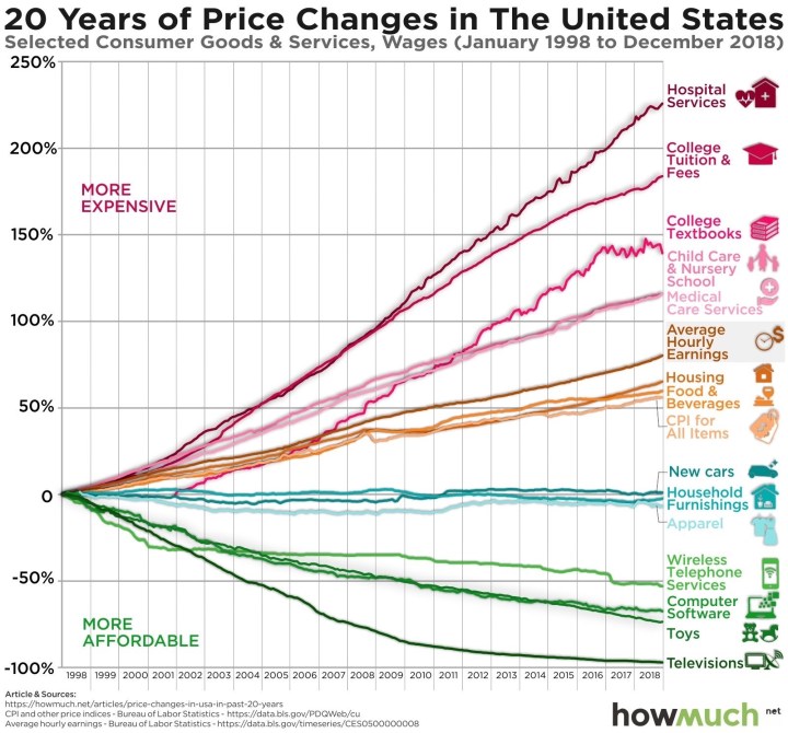
… it simply shows what has gotten more expensive of more affordable relative to everything else. The CPI for all items is included just above +50%, as is Average Hourly Earnings at 75%.
Not surprisingly, electronic stuff is at the bottom as it has gotten better & cheaper at the same time. Daily expenses such as housing, furnishings, food, cars, and apparel have also grown slower than earnings.
Healthcare & education have broadly gotten much more expensive. It’s no surprise that politicians debate these issues the most, despite both parties unable to bend the trend over two decades. Hopefully we are getting better care and better education as a result, but I will let someone else judge that.
Have a great weekend!

Life’s necessities are up. Life’s frivolities are down. And Political Ponies go round and round in the circle game.
LikeLiked by 1 person
Food is a pretty important necessity. We can take credit for that!
LikeLike
It certainly makes that all important inflation factor all the more ominous in our respective spreadsheets…Doesnt it?! 😜 Healthcare and college costs have to rationalize at some point…maybe, I am just optimistic, but there is always a cyclical reckoning in every sub-market…eventually.
LikeLiked by 1 person
Inflation can be such a killer if investments don’t increase at the same rate. The scariest part of our retirement spreadsheet is how sensitive it is to just a 100 basis point increase in inflation.
LikeLike