
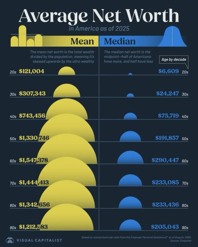
Just a quick post this morning to share this chart I came across from Visual Capitalist. I’m sure most readers here understand the difference between “mean” and “median”, but the gap between these is pretty shocking.
I’m sure many would look at the “median” column and think they are doing OK. The fact is that half of these people are in a tough place if they want to retire on time. They can probably forget about reaching FIRE (financially independent & retired early).
Instead, folks should be trying to reach the “mean” numbers on the left. At age 60, the 1.5 million in wealth would afford about $61K per year. Add in some Social Security and I guess most households will have a comfortable retirement.
I like sharing these benchmarks. When we were saving for our FIRE escape, information like this wasn’t widely available. Do the numbers seem surprising to you?
Image: Visual Capitalist

Thanks for sharing and Happy Thanksgiving. The biggest surprise for me is how high the medium numbers are for those in their 70’s and 80’s. Lots of ramifications for future wealth transfers as well as considerations on safe withdrawals.
LikeLiked by 2 people
Agree – it looks like once you’ve accumulated your wealth, most people don’t spend their way through it. The idea of “spend it all” and leave the kids nothing probably doesn’t happen as much as people think it will.
LikeLike
One would be well on their way to retiring on the mean income. The median income would be a really tight budget.
LikeLiked by 1 person
FYI … comment was stuck as “pending” for some reason. I didn’t find any “lost” comments from the LTC post. Weird.
LikeLike